Data Visualization Galleries
Publish date: Nov 13, 2021Palletes
Show all palettes. - Diverging Scale (BrBG, PiYG, PRGn, PuOr, RdBu, RdGy, RdYlBu, RdYlGn, Spectral) - Qualitative Scale (Accent, Dark2, Paired, Pastel1, Pastel2, Set1, Set2, Set3) - Sequential Scale (Blues, BuGn, BuPu, GnBu, Greens, Greys, Oranges, OrRd, PuBu, PuBuGn, PuRd, Purples, RdPu, Reds, YlGn, YlGnBu, YlOrBr, YlOrRd)
library(RColorBrewer)
display.brewer.all() # colorblindFriendly = TRUE will exclude some palettes.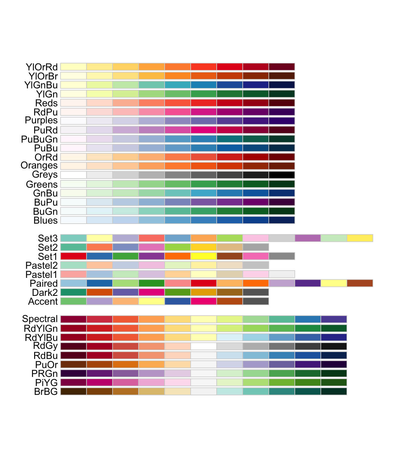
# Use following functions to apply preset or our own palette
# scale_fill_brewer(palette = "Set2")
# scale_color_brewer(palette = "Set2")
# scale_fill_manual(values=c('#00429d', '#4771b2', '#73a2c6', '#a5d5d8', '#ffffe0'))
Fonts
library(extrafont)
library(tidyverse)
library(patchwork)

# font_import()

plot <- ggplot(mtcars, aes(x=wt, y=mpg)) +
  geom_point() +
  labs(
    title = "Fuel Efficiency of 32 Cars",
    x= "Weight (x1000 lb)",
    y = "Miles per Gallon"
  )+
  theme_minimal()+
  NULL

p1 <- plot + theme(text=element_text(size=16, family="Montserrat"))
p2 <- plot + theme(text=element_text(size=16, family="Bahnschrift"))
p3 <- plot + theme(text=element_text(size=16, family="Oswald"))
p4 <- plot + theme(text=element_text(size=16, family="Rock Salt"))

# Use patchwork to arrange  4 graphs on same page
(p1 + p2) / (p3 + p4)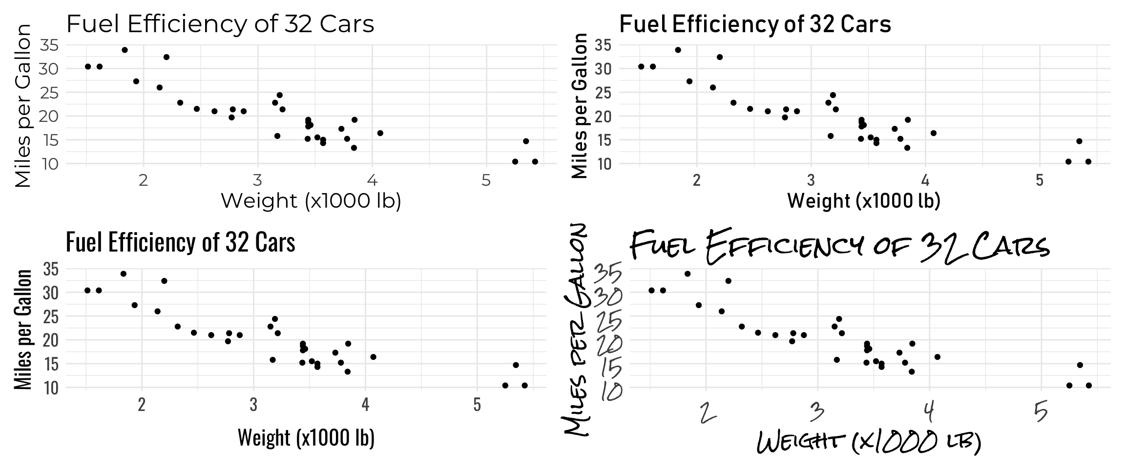
Bar plot - Emperors
library(tidyverse)
library(vroom)
library(extrafont)
library(ggtext)
# emperors data
url <- "https://github.com/rfordatascience/tidytuesday/raw/master/data/2019/2019-08-13/emperors.csv"
emperors <- vroom(url)
# Count of Causes of Death
# New variable 'assassination' to colour differently (Highlight)
emperors_assassinated <- emperors %>%
count(cause) %>%
arrange(n) %>%
mutate(
assassination = ifelse(cause == "Assassination" | cause == "Execution", TRUE, FALSE),
cause = fct_inorder(cause)
)Trick: use fct_inorder after arrange to plot in a proper order.
# get hex code for color
gplots::col2hex("grey80")
## [1] "#CCCCCC"gplots::col2hex("tomato")## [1] "#FF6347"Trick: gplots::col2hex to get hex code for color
# define colours to use: grey for everything, tomato for assassination
my_colours <- c("#CCCCCC", "#FF6347")

# let us create a text label to add as annotation to our graph
label <- "Execution is a third as likely \n as assassination"

emperors_assassinated %>%
  ggplot(aes(x = n, y = cause, fill = assassination)) +
  geom_col() +
  scale_fill_manual(values = my_colours)+
  geom_text(
    aes(label = n, x = n - .25),
    colour = "white",
    size = 5,
    hjust = 1,
    family="Lato"
  ) +

  # change font colour
  labs(title = "<b> Cause of death of Roman emperors</b><br>
       <span style = 'font-size:12pt'>Roughly half of the emperors died of <span style='color:#FF6347'>assassination</span> and <span style='color:#FF6347'>execution </span>.</span>",
       x= "Number of emperors",
       y = "")+

  #add an arrow to draw attention to a value
  geom_curve(
    data = data.frame(x = 15, y = 3.2, xend = 8.1, yend = 5),
    mapping = aes(x = x, y = y, xend = xend, yend = yend),
    colour = "grey15",
    size = 0.5,
    curvature = 0.25,
    arrow = arrow(length = unit(2, "mm"), type = "closed"),
    inherit.aes = FALSE
  ) +

  # add the text label on the graph
  geom_text(
    data = data.frame(x = 15, y = 3, label = label),
    aes(x = x, y = y, label = label),
    colour="#FF6347",
    family="Lato",
    hjust = 0.5,
    lineheight = .8,
    inherit.aes = FALSE,
  ) +

  theme_minimal() +
  theme(
    plot.title.position = "plot",
    plot.title = element_textbox_simple(size=16), # with this line, html is compiled
    axis.text = element_text(size=12),
    legend.position = "none") +
  NULL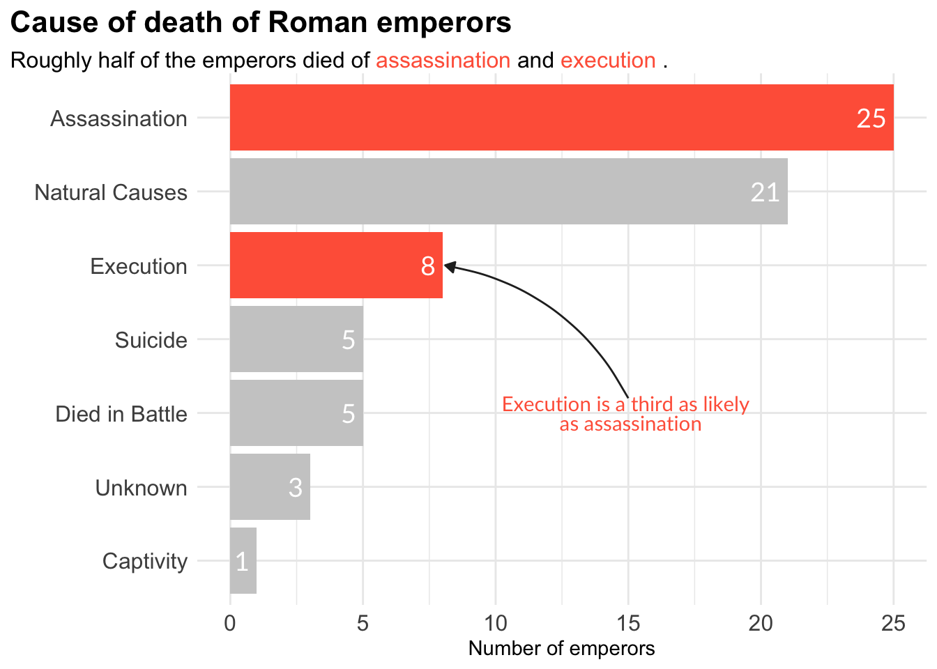
Treemap - Car Manufacturers
library(tidyverse)
library(treemapify)
library(ggalluvial)
library(ggridges)
library(ggthemes)
# Treemaps
# further treemap examples https://github.com/wilkox/treemapify
mpg %>%
filter(year == 1999) %>%
count(manufacturer) %>%
ggplot(aes(area = n,
fill = manufacturer,
label = manufacturer)) +
geom_treemap() +
geom_treemap_text() +
theme(legend.position = "none")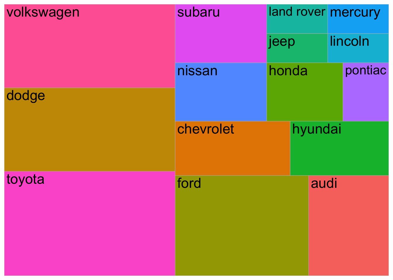
Alluvial Plot - Vaccination Survey
# Alluvial or flow/Sankey diagrams
# https://corybrunson.github.io/ggalluvial/articles/ggalluvial.html

data(vaccinations)
ggplot(vaccinations,
       aes(x = survey, y = freq,
           alluvium = subject, stratum = response,
           fill = response, label = response)) +
  scale_x_discrete(expand = c(.1, .1)) +
  geom_flow() +
  geom_stratum(alpha = .5) +
  geom_text(stat = "stratum", size = 3) +
  theme(legend.position = "none") +
  labs(title = "Vaccination survey response at three times")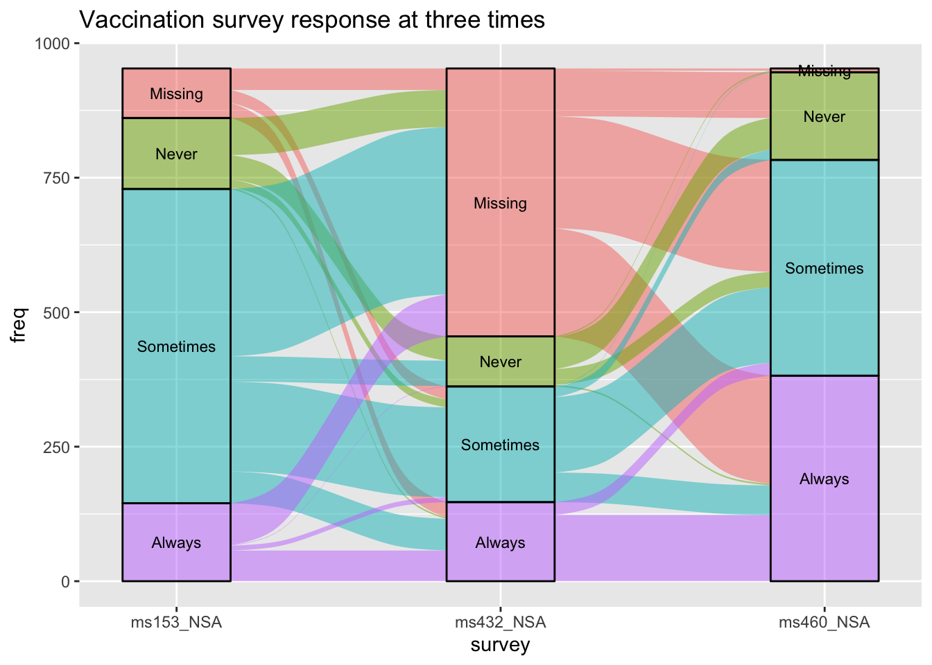
Density Plot
1-Dimension: Distributions
library(gapminder)
# create gapminder2007, by just looking at 2007 data
gapminder2007 <- filter(gapminder,
                        year == 2007)
# use ggridges::geom_density_ridges() for multiple density plots
ggplot(filter(gapminder2007,
              continent != "Oceania"),
       aes(x = lifeExp,
           fill = continent,
           y = continent)) +
  geom_density_ridges(alpha = 5/8)+
  theme_minimal()+
  guides(fill=FALSE)+
  NULL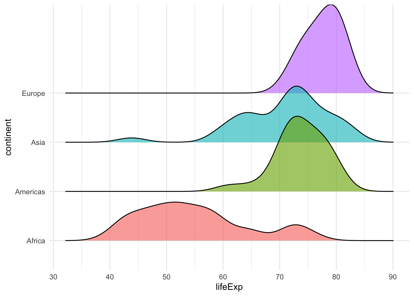
Comparision - With background
library(vroom)
# load titanic data
titanic <- vroom(here::here("data", "titanic3.csv"))
# Define a vector of colours... grey80 for background, and two different colours for male/female
density_colours <- c(
  "male" = "#0072B2",
  "female" = "#D55E00",
  "all passengers" = "grey80"
)

titanic %>%
  drop_na(sex, age) %>% # remove NAs for sex and age, and pass dataframe to ggplot

  # in the ggplot(), besides `x = age`, add `y = ..count..` to `aes()`
  ggplot(aes(x = age, y = ..count..)) +


  # Add an additional `geom_density()` that will draw the background density, for all participants.
  # This should come *before* the 'normal' `geom_density()` so that it draws the background.
  geom_density(

    # In the background geom_density(), set the `data` argument to be a function. This function
    # takes a data frame and removes sex (select x, -sex) (on which sex we will facet on later).
    data = function(x) select(x, -sex),

    # Set both `colour` and `fill` equal to "all passengers", *not* `sex`.
    aes(fill = "all passengers", colour = "all passengers")
  ) +

  # now that we have the grey background, we can plot densities
  # coloured and facet_wrapped by sex
  geom_density(aes(fill = sex, colour = sex), alpha = 0.7, bw = 2) +

  # `facet_wrap()` to facet the plot by `sex`.
  # labeller() makes it easy to assign different labellers to different factors
  facet_wrap(~sex, labeller = labeller(sex = function(sex) paste(sex, "passengers"))) +


  # use the colours you defined for male, female, and all participants
  scale_colour_manual(
    values = density_colours,
    breaks = c("male", "female", "all passengers"),
    labels = c( "males", "females","all passengers"),
    name = NULL,
    guide = guide_legend(direction = "horizontal")
  )+
  scale_fill_manual(
    values = density_colours,
    breaks = c("male", "female", "all passengers"),
    labels = c( "males", "females","all passengers"),
    name = NULL,
    guide = guide_legend(direction = "horizontal")
  )+
  scale_x_continuous(name = "age (years)", limits = c(0, 75), expand = c(0, 0)) +
  scale_y_continuous(limits = c(0, 40), expand = c(0, 0), name = "scaled density") +
  coord_cartesian(clip = "off") +
  theme_minimal() +
  theme(legend.position = "bottom",
        legend.justification = "center",
        text=element_text(size=12, family="Lato"),
        plot.title.position = "plot"
  ) +
  NULL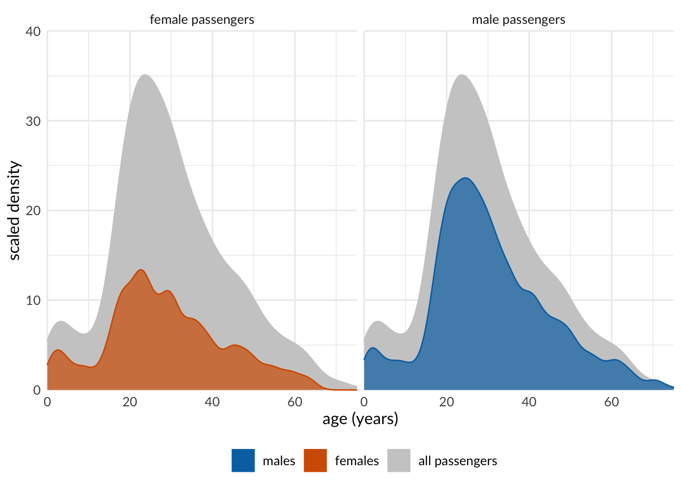
Comparision - with half box plot
library(tidyverse)
library(gapminder)
library(ggridges)
library(gghalves)
# use gghalves::geom_half_boxplot(), gghalves::geom_half_point()
ggplot(filter(gapminder2007,
              continent != "Oceania"),
       aes(y = lifeExp,
           x = continent,
           colour = continent)) +
  geom_half_boxplot(side = "l") + # half boxplot to the left
  geom_half_point(side = "r")+    # points to the right
  theme_minimal()+
  guides(fill = FALSE, color = FALSE)+
  NULL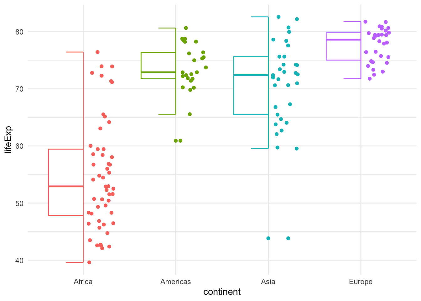
# Raincloud plots
ggplot(filter(gapminder2007,
              continent != "Oceania"),
       aes(y = lifeExp,
           x = continent,
           colour = continent)) +
  geom_half_point(side = "l", size = 0.3) +
  geom_half_boxplot(side = "l", width = 0.5,
                    alpha = 0.3, nudge = 0.1) +
  geom_half_violin(aes(fill = continent),
                   alpha = 0.8,
                   side = "r") +
  guides(fill = FALSE, color = FALSE) +
  coord_flip()+
  theme_minimal()+
  NULL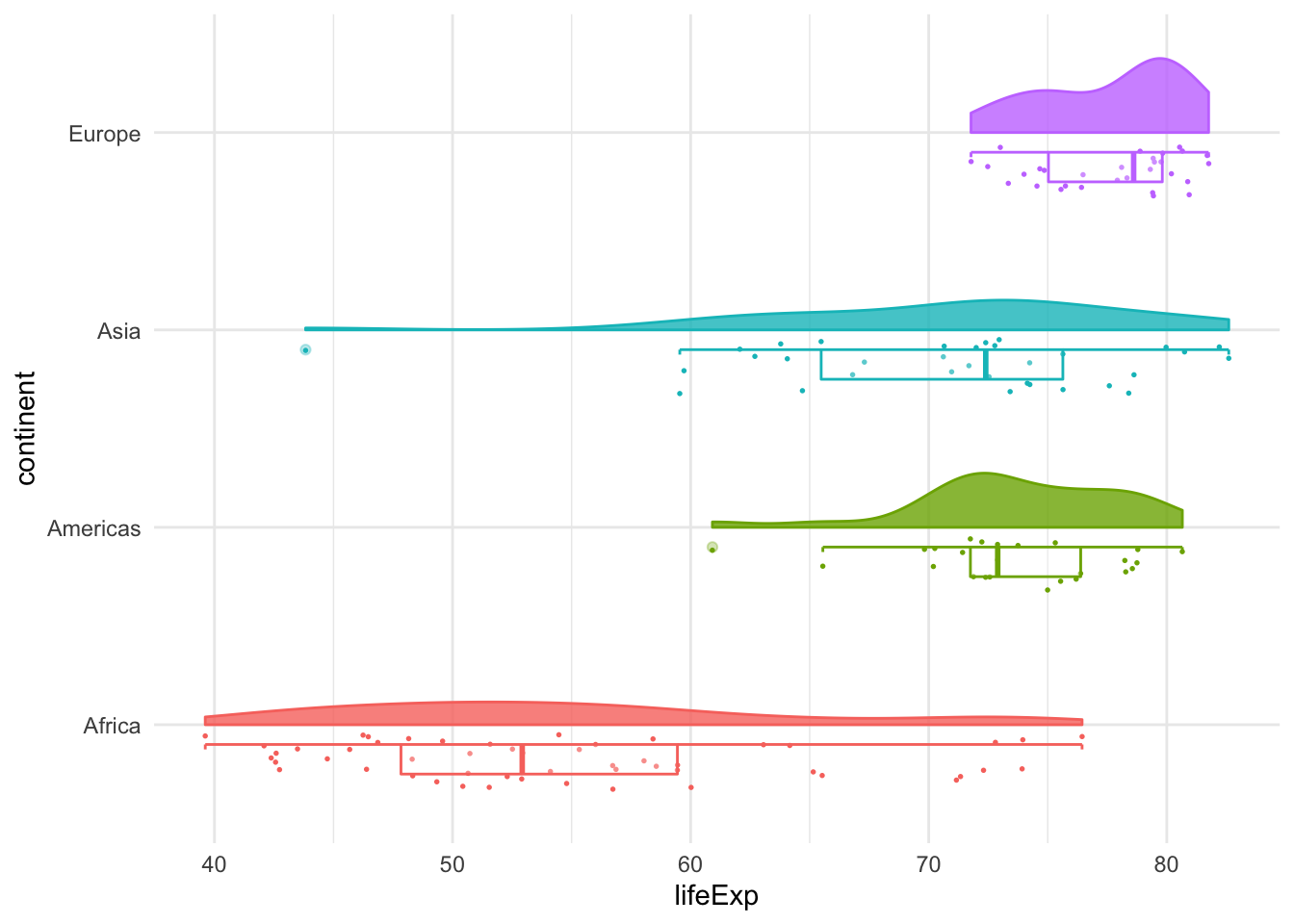
2-Dimension
mpg %>%
  filter(class != "2seater") %>%
  ggplot(aes(x = cty, y = hwy)) +
  geom_density_2d(aes(color = class)) +
  facet_wrap(~class) +
  theme(legend.position = "none")+
  labs(x="city miles per gallon",
       y="highway miles per gallon")+
  NULL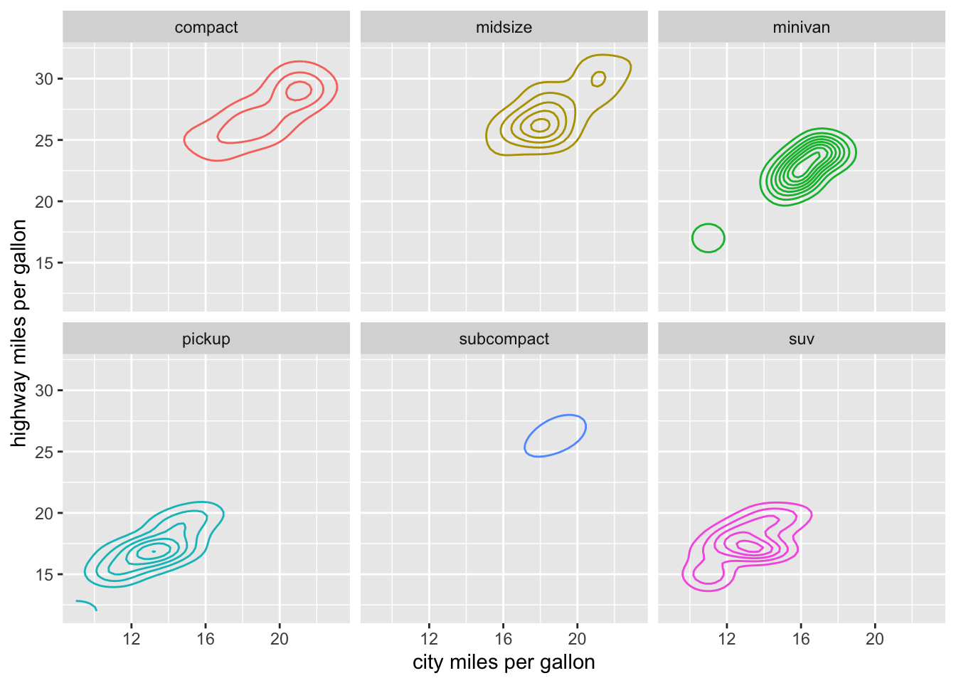
# geom_hex: Divides the plane into regular hexagons
mpg %>%
  filter(class != "2seater") %>%
  ggplot(aes(x = cty, y = hwy)) +
  geom_hex(aes(color = class), bins = 10) +
  facet_wrap(~class) +
  #theme(legend.position = "none")+
  labs(x="city miles per gallon",
       y="highway miles per gallon")+
  NULL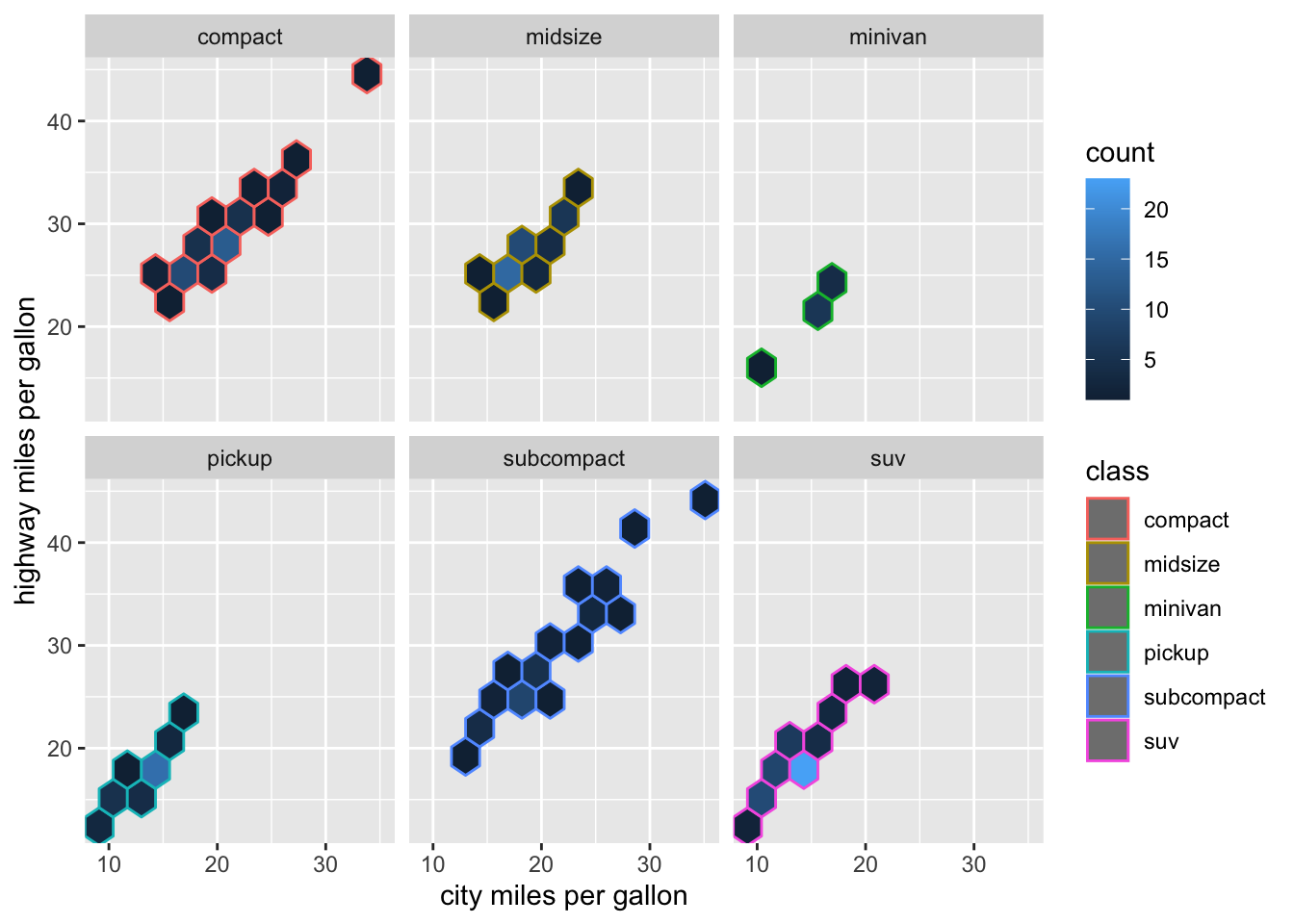
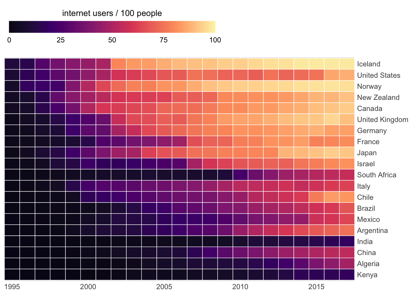
Heatmap
library(tidyverse)
library(wbstats)

# https://data.worldbank.org/indicator/IT.NET.USER.ZS
# Download data for Individuals Using Internet (% Of Population) IT.NET.USER.ZS
# using the wbstats package

internet <- wb_data(country = "countries_only",
                      indicator = "IT.NET.USER.ZS",
                      start_date = 1995, end_date = 2017)

country_list = c("United States", "China", "India", "Japan", "Algeria",
                 "Brazil", "Germany", "France", "United Kingdom", "Italy", "New Zealand",
                 "Canada", "Mexico", "Chile", "Argentina", "Norway", "South Africa", "Kenya",
                 "Israel", "Iceland")

internet_short <- filter(internet, country %in% country_list) %>%
  rename(value = IT.NET.USER.ZS) %>%
  mutate(users = ifelse(is.na(value), 0, value),
         year = as.numeric(date))

internet_summary <- internet_short %>%
  group_by(country) %>%
  summarize(year1 = min(year[users > 0]),
            last = users[n()]) %>%
  arrange(last, desc(year1))

internet_short <- internet_short %>%
  mutate(country = factor(country, levels = internet_summary$country))

ggplot(filter(internet_short, year > 1993),
       aes(x = year, y = country, fill = users)) +
  geom_tile(color = "white", size = 0.25) +
  scale_fill_viridis_c(
    option = "A", begin = 0.05, end = 0.98,
    limits = c(0, 100),
    name = "internet users / 100 people",
    guide = guide_colorbar(
      direction = "horizontal",
      label.position = "bottom",
      title.position = "top",
      ticks = FALSE,
      barwidth = grid::unit(3.5, "in"),
      barheight = grid::unit(0.2, "in")
    )
  ) +
  scale_x_continuous(expand = c(0, 0), name = NULL) +
  scale_y_discrete(name = NULL, position = "right") +
  theme(
    axis.line = element_blank(),
    axis.ticks = element_blank(),
    axis.ticks.length = grid::unit(1, "pt"),
    legend.position = "top",
    legend.justification = "left",
    legend.title.align = 0.5,
    legend.title = element_text(size = 12*12/14)
  )
## X-Y relationships
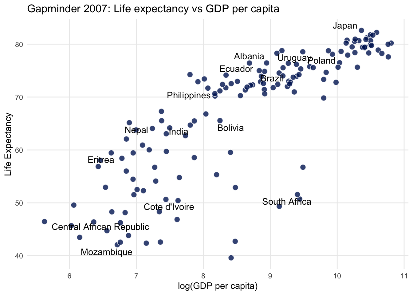
Linear Relationship
City miles vs Highway miles per gallon
library(tidyverse)
library(gapminder)
library(extrafont)
library(ggrepel)
set.seed(7)
# 20 random countries
some_countries <- gapminder$country %>%
levels() %>%
sample(20)
gapminder %>%
filter(year == 2007) %>%
mutate(
label = ifelse(country %in% some_countries, as.character(country), "")
) %>%
ggplot(aes(log(gdpPercap), lifeExp)) +
geom_point(
size = 3,
alpha = 0.8,
shape = 21,
colour = "white",
fill = "#001e62"
)+
geom_text_repel(aes(label=label))+
theme_minimal()+
theme(panel.grid.minor = element_blank())+
labs(
title = "Gapminder 2007: Life expectancy vs GDP per capita",
x = "log(GDP per capita)",
y = "Life Expectancy"
)
Secondary Axis
car_counts <- mpg %>%
  group_by(drv) %>%
  summarize(total = n())

total_cars <- sum(car_counts$total)

ggplot(car_counts,
       aes(x = drv, y = total,
           color = drv)) +
  geom_point() +
  scale_y_continuous(
    sec.axis = sec_axis(
      trans = ~ . / total_cars,
      labels = scales::percent,
      name = "%")
  ) +
  guides(fill = FALSE)+
  theme_minimal()+
  NULL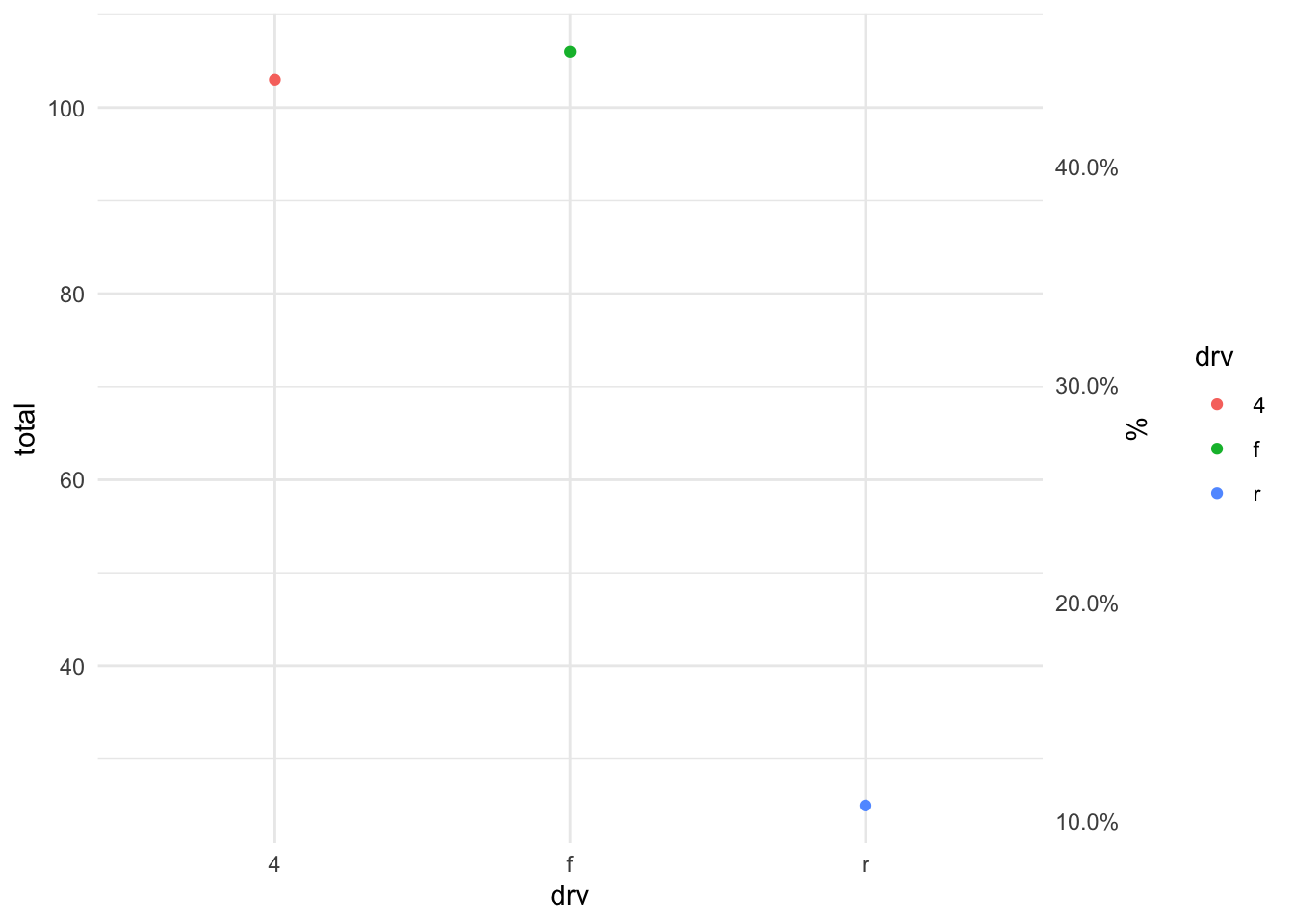
Time Series - Flights Number
library(nycflights13)
# just filter to have first 2 months
flights %>%
  mutate(day=as.Date(time_hour)) %>%
  filter(day < "2013-03-01") %>%
  count(day,origin) %>%
  ggplot(aes(x=day, y=n, color=origin)) +
  geom_line(aes(group=origin)) +
  geom_point() +
  theme_bw()+
  theme(legend.position="bottom")+
  labs(subtitle="Number of Flights per Airports")+
  NULL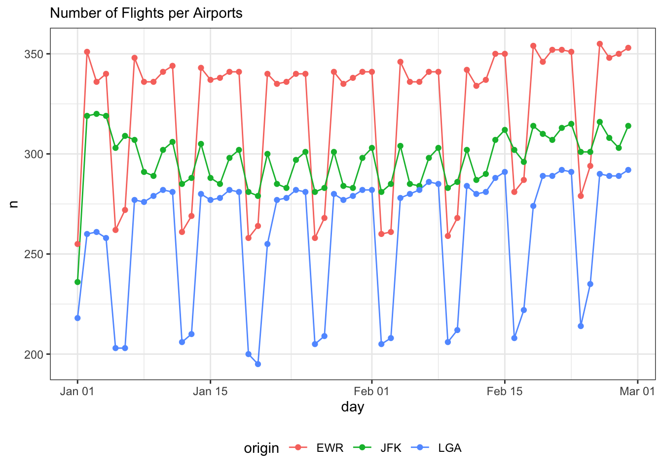
To highlight one among all others:
library(gghighlight)
africa <- gapminder %>%
  filter(continent == "Africa") %>%
  # sort by life expectancy in 1952, the first year in the dataframe
  arrange(year, desc(lifeExp)) %>%
  mutate(country = fct_inorder(factor(country)))

# find the African countries that had better life expectancy in 1992 compared to 2007
life_expectancy_dropped <- africa %>%

  # pivot wider to be able to compare life expectancy in 1992 to 2007,
  pivot_wider(country, names_from = year, values_from = lifeExp) %>%

  # create new variables, `le_dropped`, that is `TRUE` if life expectancy was higher in 1992
  # and `le_delta` which is simply the difference between life expectancy in 2007 and 1992
  mutate(
    le_delta = `2007` - `1992`,
    le_dropped = `1992` > `2007`) %>%
  select(-c(2:13))

# join `le_dropped` to each observation for each country
africa <- left_join(africa, life_expectancy_dropped, by = "country")

le_line_plot <- africa %>%
  ggplot(aes(year, lifeExp, color = country, group = country)) +
  geom_line(size = 1.2, alpha = 0.9, color = "#E58C23") +
  theme_minimal(base_size = 14) +

  # let us add a vertical line at 1992, when we start our comparison
  geom_vline(xintercept = 1992, alpha = 0.1)+

  theme(
    # remove legend using the legend.position argument in theme()
    legend.position = "none",
    panel.grid.major.x = element_blank(),
    panel.grid.minor = element_blank()
  ) +
  labs(
    title = "Life expectancy reduction, 1992 to 2007",
    y = "life expectancy",
    caption = "sorted by life expectancy in 1952") +
  scale_x_continuous(breaks = seq(1952, 2007, 10))+
  NULL

# Using `gghighlight()` we add add direct labels to the plot.
# The first argument defines which lines to highlight using `le_dropped`.
# Also add the arguments `use_group_by = FALSE` and `unhighlighted_colour = "grey80"`.

#  If we facet_wrap() we do not need direct labels, so set `use_direct_label = FALSE`

le_line_plot +
  gghighlight(
    le_dropped,
    use_group_by = FALSE,
    use_direct_label = FALSE,
    unhighlighted_colour = "grey80"
  ) +
  facet_wrap(~country)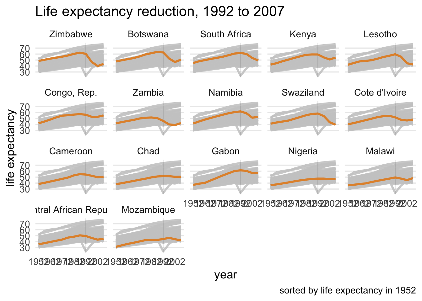
Confidence Interval
l3 <- c("compact","subcompact","midsize",
        "2seater","minivan","suv","pickup")
# avg highway mpg with boostrapped 95% CI
mpg %>%
  mutate(class = factor(class, levels = l3)) %>%
  ggplot(aes(x = class, y = hwy, color = class))+
stat_summary(fun.y = mean, geom = "point") +
  stat_summary(fun.data = mean_cl_boot,
               geom = "errorbar") +
  theme_bw() +
  coord_flip() +
  theme(legend.position = "none") +
  labs(x = " ", y = "Highway MPG with 95% CI")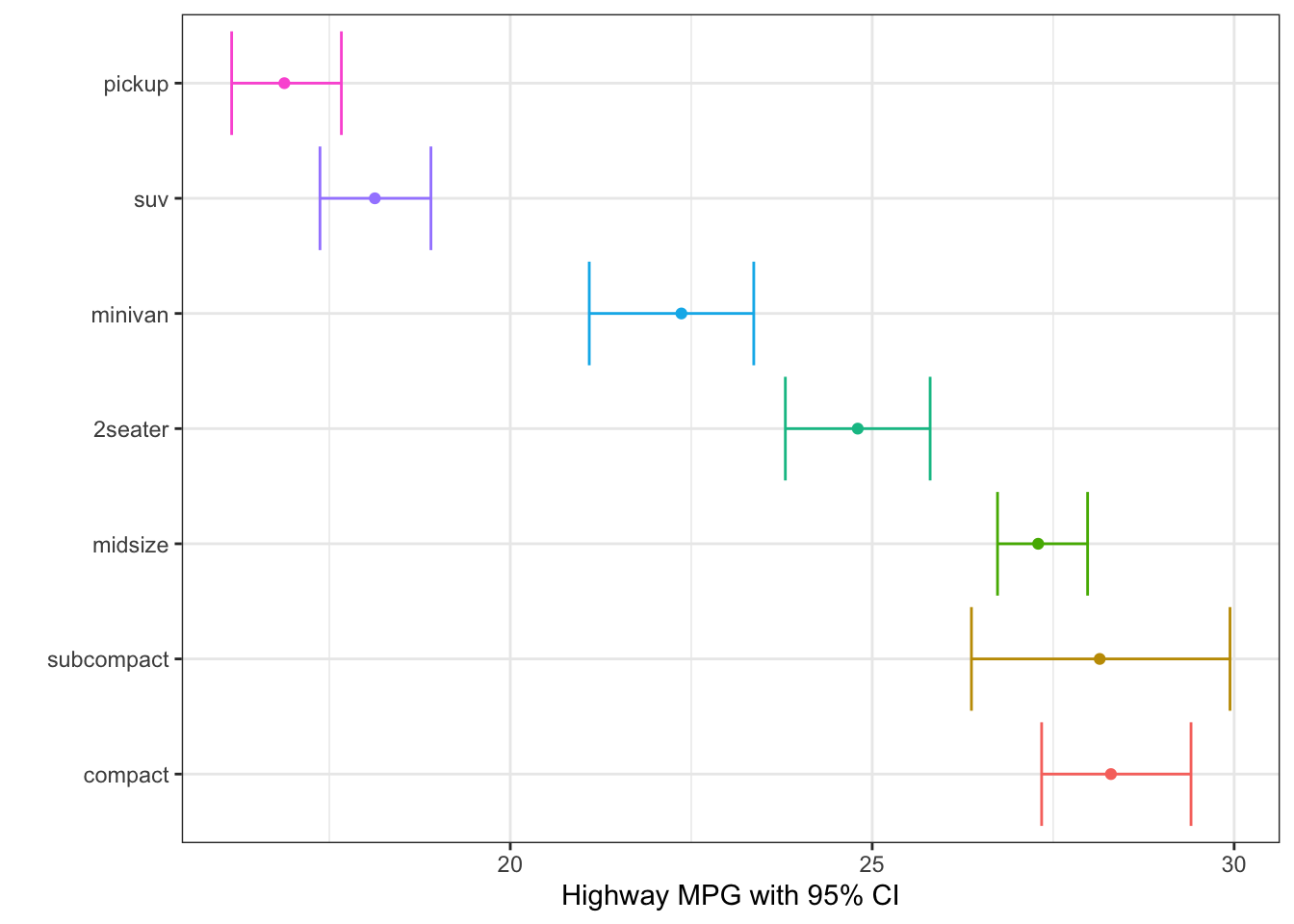
Jitter - to randomly spread the points
# geom_jitter
origin <- tibble(
  x = rep(0, times = 10),
  y = rep(0, times = 10)
)

#geom_point will only plot one point, as for all points x=0, y=0
ggplot(origin, aes(x=x, y=y))+
  geom_point(size=5, colour="orange")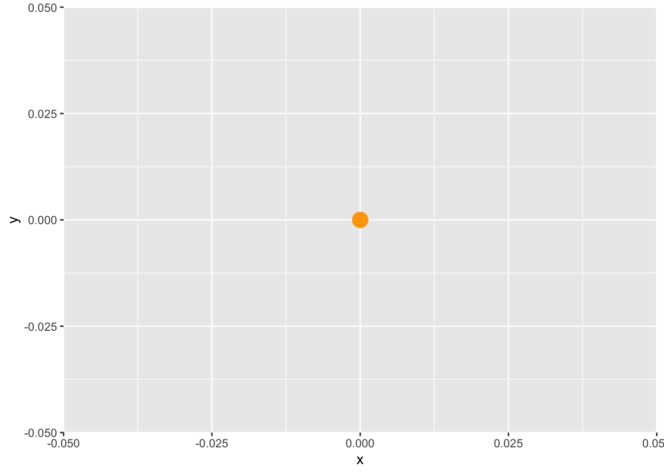
# geom_jitter will randomly spread the points around (0.0)
ggplot(origin, aes(x=x, y=y))+
  geom_point(size=5, colour="orange")+
  geom_jitter()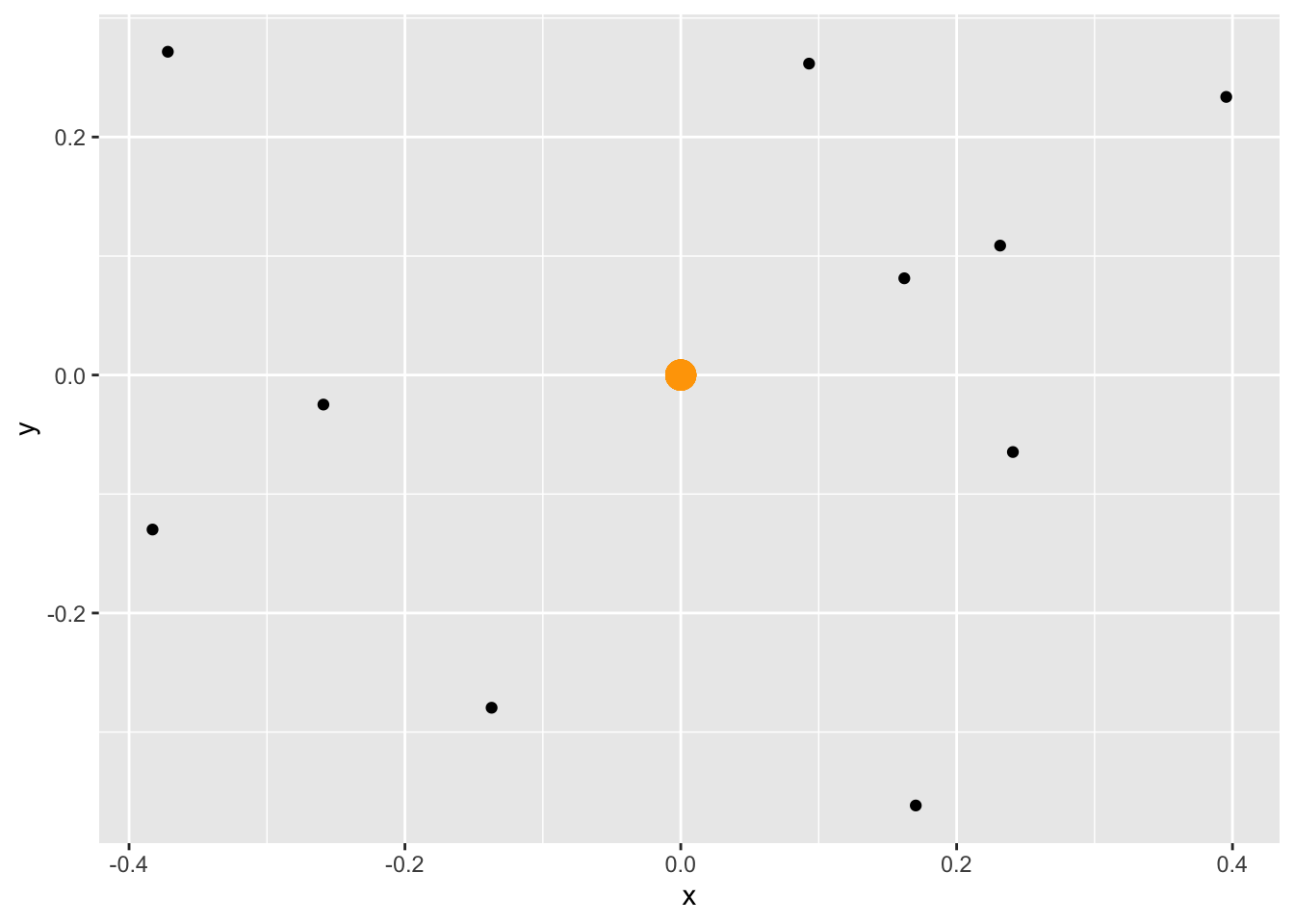
Maps
sf basics
library(sf)
library(usethis)
library(tidyverse)
library(rnaturalearth)
library(patchwork)
world <- ne_countries(scale = "medium", returnclass = "sf") %>%
  filter(name != "Antarctica")
# what happens if we change the crs/projection

base_map <- ggplot() +
  geom_sf(data = world,
          aes(
            geometry = geometry, #use Natural Earth World boundaries
            fill = region_un  #fill colour = country’s region
          ),
          colour = "grey90",      # borders between regions
          show.legend = FALSE    # no legend) +
  )+
  theme_minimal()+
  NULL


base_map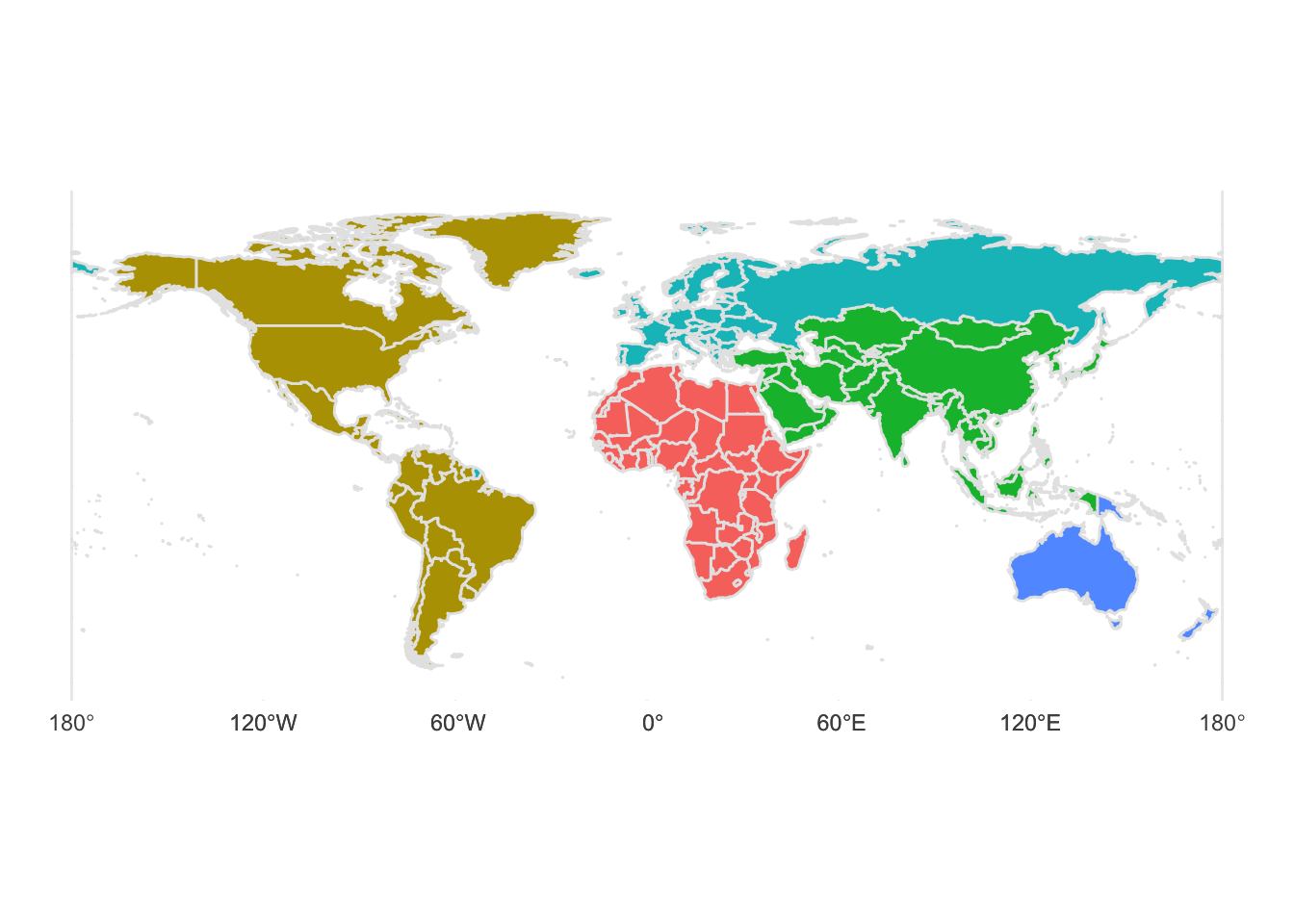
# Longitude/latitude
map_lat_lon <- base_map +
  coord_sf(crs = "+proj=longlat +ellps=WGS84 +datum=WGS84 +no_def") +
  labs(title = "Longitude-latitude",
       subtitle = 'crs = "+proj=longlat +ellps=WGS84"')

# Robinson
map_robinson <- base_map +
  coord_sf(crs = "+proj=robin") +
  labs(title = "Robinson",
       subtitle = 'crs = "+proj=robin"')

# Mercator (ew)
map_mercator <- base_map +
  coord_sf(crs = "+proj=merc") +
  labs(title = "Mercator",
       subtitle = 'crs = "+proj=merc"')

# Azimuthal Equidistant
map_azimuthal_equidistant <- base_map +
  coord_sf(crs = "+proj=aeqd") +  # Gall Peters / Equidistant cylindrical
  labs(title = "Azimuthal Equidistant",
       subtitle = "crs = +proj=aeqd")

#use patchwork to arrange 4 maps in one page
(map_lat_lon / map_mercator) | ( map_robinson / map_azimuthal_equidistant)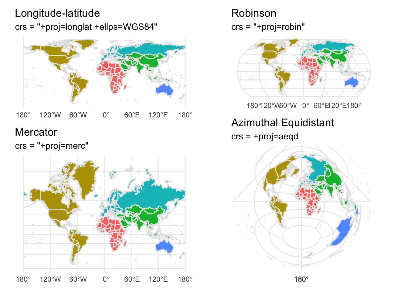
with Heatmap
# remotes::install_github("kjhealy/nycdogs")
library(nycdogs)
library(sf) # for geospatial visualisation

# load the data
data("nyc_license")
data("nyc_zips")

# what is the prevalent NYC breed ?
nyc_license %>%
  count(breed_rc, sort=TRUE)
## # A tibble: 301 × 2
## breed_rc n
## <chr> <int>
## 1 Unknown 16797
## 2 Yorkshire Terrier 7786
## 3 Shih Tzu 7154
## 4 Labrador (or Crossbreed) 6986
## 5 Pit Bull (or Mix) 6751
## 6 Chihuahua 5785
## 7 Maltese 4308
## 8 Pomeranian 2197
## 9 Beagle 2111
## 10 Jack Russell Terrier 2041
## # … with 291 more rows# what is the prevalent NYC dog name by animal gender?
# Bella for girls, Max for boys!
nyc_license %>%
count(animal_name, animal_gender, sort=TRUE) ## # A tibble: 19,294 × 3
## animal_name animal_gender n
## <chr> <chr> <int>
## 1 Unknown M 1401
## 2 Bella F 1365
## 3 Max M 1272
## 4 Name Not Provided M 1111
## 5 Unknown F 1093
## 6 Lola F 875
## 7 Charlie M 871
## 8 Rocky M 869
## 9 Lucy F 767
## 10 Buddy M 743
## # … with 19,284 more rows# Maps for two Breeds
top_breeds <- nyc_license %>%
group_by(zip_code, breed_rc) %>%
tally() %>%
filter(n>10) %>%
mutate(freq = n / sum(n),
pct = round(freq*100, 2)) %>%
filter(breed_rc == "Yorkshire Terrier" | breed_rc == "Labrador (or Crossbreed)")
top_breeds_map <- left_join(nyc_zips, top_breeds) %>%
na.omit()
top_breeds_map %>% ggplot(mapping = aes(fill = pct)) +
geom_sf(color = "gray80", size = 0.1) +
scale_fill_viridis_b(option = "A", direction= -1) +
labs(fill = "Percent of Licensed Dogs") +
facet_wrap(~breed_rc)+
theme_void() +
guides(fill = guide_legend(title.position = "top",
label.position = "bottom")) 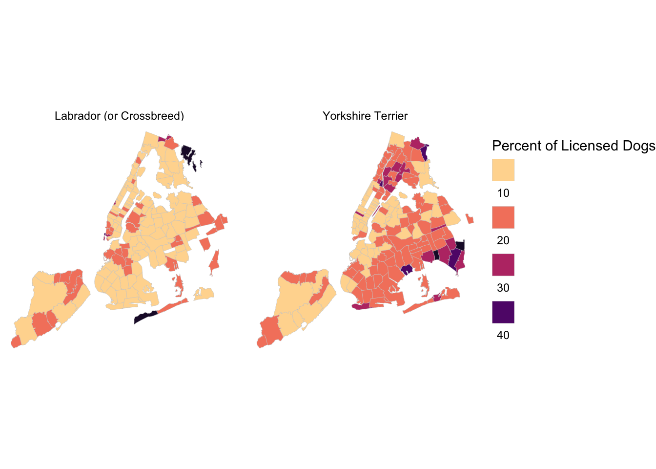
with Arrows
library(tidyverse)
library(sf)
library(rnaturalearth)
library(eurostat)
library(lubridate)
library(opencage)
library(hrbrthemes)
library(gridExtra)
# Air passenger transport between the main airports of the United Kingdom
# and their main partner airports (routes data)
# https://ec.europa.eu/eurostat/web/products-datasets/-/avia_par_uk
flights_UK <- get_eurostat(id="avia_par_uk",
select_time = "M") #get monthly data
# filter passengers only
flights <- flights_UK %>%
dplyr::filter(unit == "PAS") %>%
mutate(
origin = str_sub(airp_pr, 1, 7),
destination = str_sub(airp_pr, -7),
from = str_sub(origin, 4,7),
to = str_sub(destination, 4,7),
year = year(time),
month_name = month(time, label = TRUE)
)
flights %>%
filter(year>=2018) %>%
group_by(origin,year) %>%
summarise(totalpassengers = sum(values)) %>%
arrange(desc(totalpassengers))## # A tibble: 95 × 3
## # Groups: origin [34]
## origin year totalpassengers
## <chr> <dbl> <dbl>
## 1 UK_EGLL 2019 315616656
## 2 UK_EGLL 2018 314171004
## 3 UK_EGKK 2019 174720542
## 4 UK_EGKK 2018 173091550
## 5 UK_EGCC 2019 102403412
## 6 UK_EGSS 2019 101440212
## 7 UK_EGSS 2018 100518160
## 8 UK_EGCC 2018 98376330
## 9 UK_EGLL 2020 64403150
## 10 UK_EGGW 2019 62841150
## # … with 85 more rowslondon_airports <- c("UK_EGLL","UK_EGKK","UK_EGSS","UK_EGGW")
london_flights <- flights %>%
dplyr::filter(origin %in% london_airports) %>%
distinct()
# count number of flights from origins to destinations
origins <- london_flights %>%
count(from, sort=TRUE) %>%
mutate(prop = n/sum(n))
destinations <- london_flights %>%
count(to, sort=TRUE) %>%
mutate(prop = n/sum(n))
# geocode origin/destination airports
origins <- origins %>%
mutate(
origin_geo = purrr::map(from, opencage_forward, limit=1)
) %>%
unnest_wider(origin_geo) %>%
unnest(results) %>%
rename(from_y = geometry.lat,
from_x = geometry.lng)
destinations <- destinations %>%
mutate(
destination_geo = purrr::map(to, opencage_forward, limit=1)
) %>%
unnest_wider(destination_geo) %>%
unnest(results) %>%
rename(to_y = geometry.lat,
to_x = geometry.lng)
#geocode airports
londonflights2018 <- london_flights %>%
filter(year==2018) %>%
group_by(year, destination, origin, from, to) %>%
summarise(totalpassengers = sum(values)) %>%
arrange(desc(totalpassengers)) %>%
#geocode origin (from_x, from_y)
mutate(
origin_geo = purrr::map(from, opencage_forward, limit=1)
) %>%
unnest_wider(origin_geo) %>%
unnest(results) %>%
rename(from_y = geometry.lat,
from_x = geometry.lng) %>%
select(destination, from, to, totalpassengers, from_x, from_y) %>%
#geocode destination (to_x, to_y)
mutate(
destination_geo = purrr::map(to, opencage_forward, limit=1)
) %>%
unnest_wider(destination_geo) %>%
unnest(results) %>%
rename(to_y = geometry.lat,
to_x = geometry.lng) %>%
select(destination, from, to, totalpassengers, from_x, from_y, to_x, to_y)
# for displaying a data table as annotation next to the map
table <- as_tibble(londonflights2018 %>% group_by(destination) %>% head(20)) %>%
select(Origin = origin, Destination = destination, Passengers = totalpassengers) %>%
mutate(Passengers = glue::glue("{scales::comma(Passengers)}")) %>%
tableGrob(
rows = NULL,
theme = ttheme_default(
core = list(
fg_params = list(
fontfamily = "Lato",
hjust = c(rep(0, 20), rep(1, 20)),
x = c(rep(0.1, 20), rep(0.9, 20))
)
)
)
)
ggplot() +
geom_sf(data = world, size = 0.125) +
geom_curve(
data = londonflights2018 %>% head(20),
aes(x = from_x, y = from_y, xend = to_x, yend = to_y,
size= totalpassengers, colour = totalpassengers),
curvature = 0.2, arrow = arrow(length = unit(3, "pt"), type = "closed"),
)+
theme_void()+
annotation_custom(table, xmin=-165, xmax=-160, ymin=-120, ymax=90) +
labs(
x = NULL, y = NULL,
title = "Top 20 destinations for London flights in 2018",
subtitle = "Data source: Eurostat , id=avia_par_uk"
) +
theme(
text=element_text(size=16, family="Lato"),
plot.title = element_text(),
plot.title.position = "plot",
axis.text.x = element_blank(),
axis.title.y = element_blank(),
legend.position = "none"
) +
NULL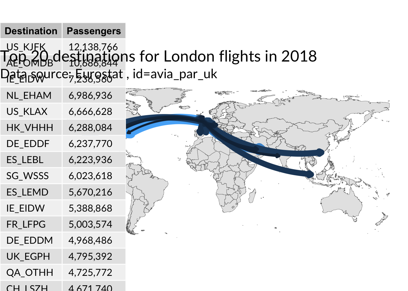
London Wards Map
mapview interactive map
library(tidyverse)
library(vroom)
library(sf)
library(rnaturalearth)
library(rnaturalearthdata)
library(rgdal)
library(rgeos)
library(patchwork)
library(mapview)
library(tmap)
library(viridis)
url <- "https://covid.ourworldindata.org/data/owid-covid-data.csv"
covid_data <- vroom(url) %>%
mutate(perc = round(100 * people_fully_vaccinated / population, 2))
map <- ne_countries(scale = "medium", returnclass = "sf") %>%
dplyr::select(name, iso_a3, geometry) %>%
filter(!name %in% c("Greenland", "Antarctica"))
df <- map %>%
rename(iso_code=iso_a3) %>%
left_join(
covid_data %>%
select(location, iso_code, date, people_fully_vaccinated, perc, continent) %>%
group_by(location) %>%
slice_max(order_by = perc, n=1) %>%
ungroup(),
by = "iso_code") %>%
drop_na(date)
# use viridis plasma colour scale
df %>%
mapview::mapview(zcol = "perc",
at = seq(0, max(df$perc, na.rm = TRUE), 10),
legend = TRUE,
col.regions = plasma(n = 8),
layer.name = "Fully Vaccinated %")# Use tmap package
df %>%
filter(continent == "Asia") %>%
tm_shape() +
tmap_options(check.and.fix = TRUE)+
tm_polygons(col = "perc",
n = 5,
title = "% vaccinated",
palette = "Blues") 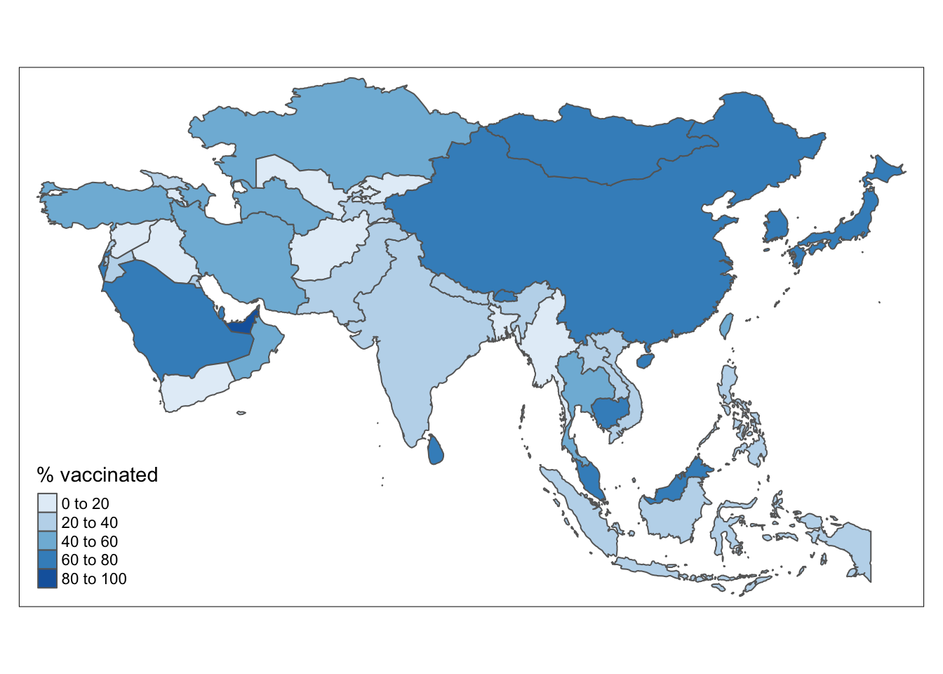
tmap_mode("view") # for interactive maps
df %>%
filter(continent == "Asia") %>%
tm_shape() +
tm_polygons(col = "perc",
n = 5,
title = "% vaccinated",
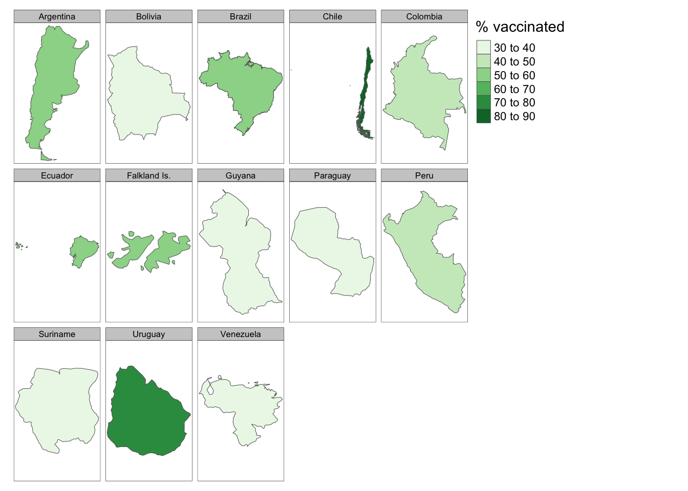
palette = "Blues") tmap_mode("plot") # back to static maps for tmap
df %>%
filter(continent == "South America") %>%
tm_shape() +
tm_polygons(col = "perc",
n = 5,
title = "% vaccinated",
palette = "Greens") +
tmap_options(limits = c(facets.view = 13)) +
tm_facets(by = "name")